The Importance of Responsive Design in 2026
Responsive Design: Why It Matters More Than Ever
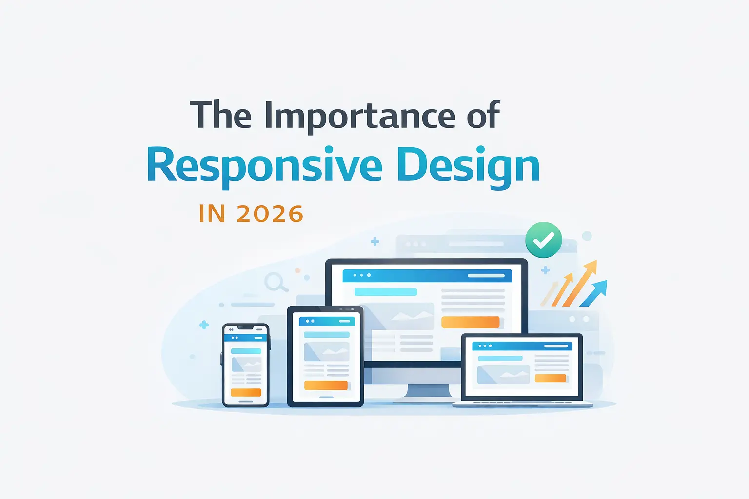
If you look around today, people are browsing websites from everywhere—phones, tablets, laptops, even TVs. Because of that, building a website that only looks good on a desktop just doesn’t cut it anymore. Responsive design isn’t optional now—it’s something every developer has to get right.
🚀 Why Responsive Design Matters
A Better Experience for Users
At the end of the day, everything comes down to the user.
Imagine opening a website on your phone and having to zoom in, scroll sideways, or struggle to tap buttons. Most people will just leave.
A responsive website avoids all of that. It adjusts itself automatically so everything feels natural—no matter what device someone is using.
- Text is easy to read
- Buttons are easy to tap
- Layout feels clean and organized
That smooth experience keeps users engaged.
It Helps Your SEO (A Lot)
Search engines, especially Google, now focus on the mobile version of your site first. This is called mobile-first indexing.
So if your website doesn’t work well on mobile:
- Your rankings can drop
- Your traffic can decrease
- Your visibility suffers
A responsive design makes sure your site performs well everywhere—and that directly helps your SEO.
Saves Time and Money
Instead of building:
- one website for desktop
- another for mobile
You just build one responsive site.
That means:
- Less code to maintain
- Faster updates
- Fewer bugs
In the long run, it’s simply more efficient.
🧠 Key Principles of Responsive Design
Start with Mobile First
A smart approach is to design for the smallest screen first, then expand for larger ones.
Why this works so well:
- You focus on what really matters
- You avoid unnecessary clutter
- Performance stays strong
.container {
  padding: 1rem;
}

@media (min-width: 768px) {
  .container {
    padding: 2rem;
  }
}
Use Flexible Layouts
Avoid fixed pixel sizes whenever possible.
Instead, use flexible units like:
- percentages (%)
rem/em- viewport units (
vw,vh)
This allows your layout to naturally adjust to different screen sizes.
.grid {
  display: grid;
  grid-template-columns: repeat(auto-fit, minmax(250px, 1fr));
}
Make Images Responsive Too
Images should scale based on the device.
- Use
srcsetfor different sizes - Compress images to reduce load time
- Prefer modern formats like WebP
<img
  src="small.jpg"
  srcset="medium.jpg 768w, large.jpg 1200w"
  alt="Responsive example"
/>
Design for Touch
On mobile devices, users interact with fingers—not a mouse.
That means:
- Buttons should be big enough (at least 44x44px)
- Elements should have enough spacing
- Avoid relying only on hover effects
🎯 Practical UI/UX Tips
Keep Layouts Simple
Clean layouts always work better.
- Use Grid for structure
- Use Flexbox for alignment
- Add enough spacing between sections
Rethink Navigation
Navigation on mobile needs special attention.
- Use a hamburger menu or bottom navigation
- Keep options minimal
- Make everything easy to reach
Improve Readability
Text should be comfortable to read on any screen.
- Use
remfor font sizes - Keep line length reasonable
- Ensure good contrast
Focus on Performance
Speed matters—especially on mobile networks.
- Minimize heavy scripts
- Lazy load images and components
- Load only what’s needed
if (window.innerWidth > 768) {
  import('./heavy-component.js');
}
🧪 Testing Is Key
Don’t rely only on browser tools.
Yes, DevTools help—but real devices tell the real story.
Test on:
- Different screen sizes
- Different browsers
- Real mobile devices
You’ll often find issues you didn’t expect.
⚠️ Common Mistakes
A few things that can break your responsive design:
- Using fixed widths everywhere
- Ignoring mobile users during design
- Making buttons too small
- Loading large images unnecessarily
- Not testing properly
🏁 Final Thoughts
Responsive design is not just about making things “fit” on a screen. It’s about making your website feel right—no matter how someone accesses it.
When you focus on:
- simplicity
- flexibility
- performance
- real user behavior
you end up building something that works everywhere—and feels good to use.
If you want, I can next turn this into a clean React + Tailwind blog UI layout or even a SaaS documentation page design based on your stack.